Fazenda Um
// visual identity, branding, website

The client
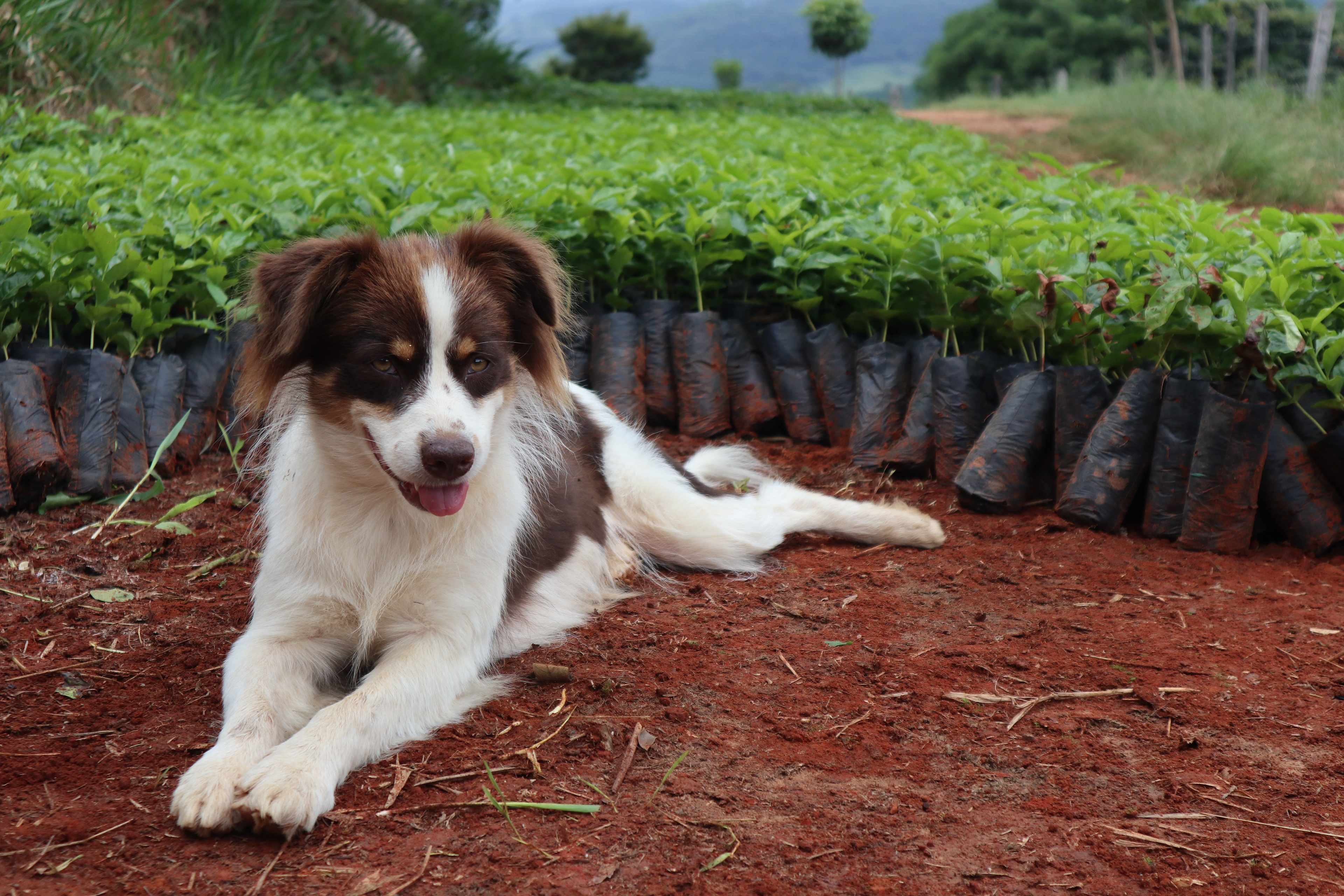
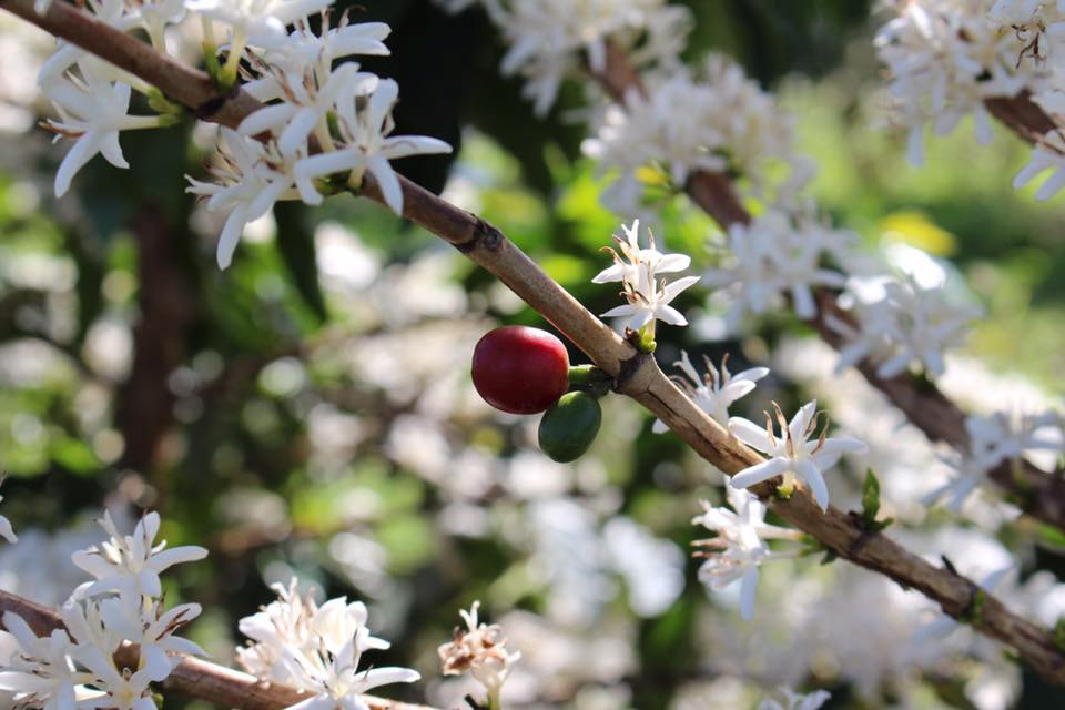
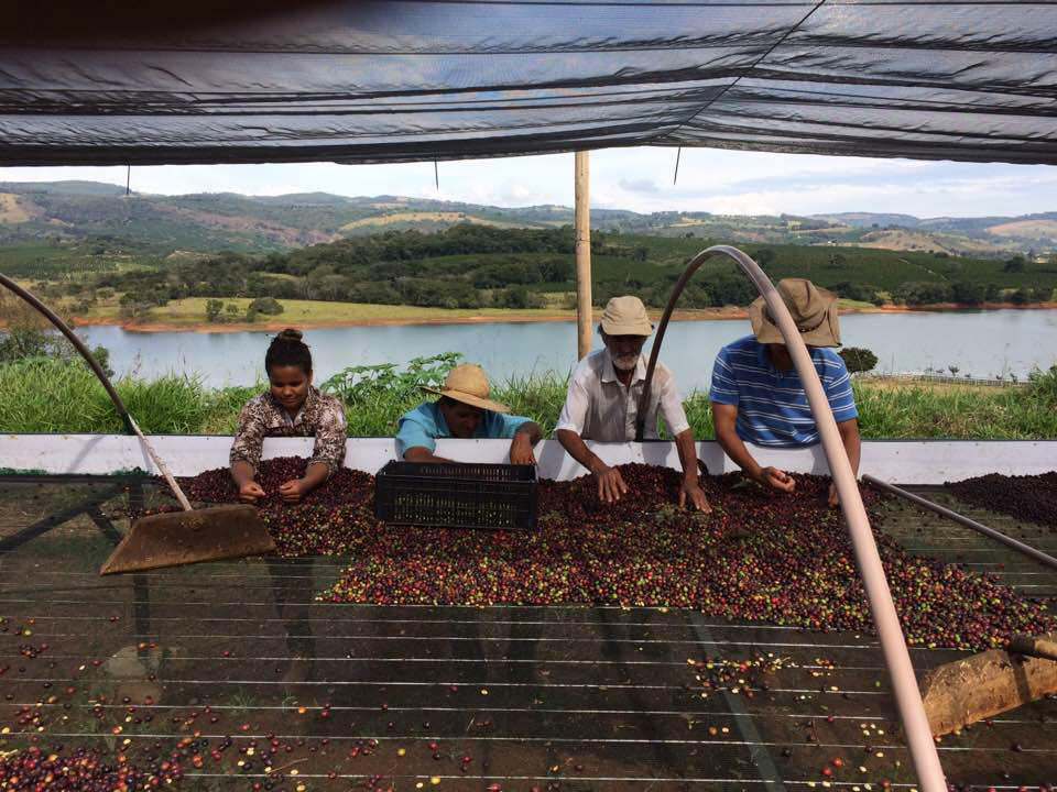
Fazenda Um is a farm located in the state of Minas Gerais, Brazil, producing coffee beans of the highest quality for the national and international markets. The brand visuals aimed to showcase a modern family business that is proud of their work in the land, as well as the natural qualities of their farm’s landscape.

The core of the design: family and land
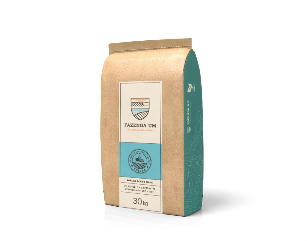
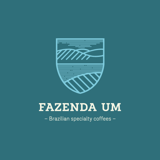
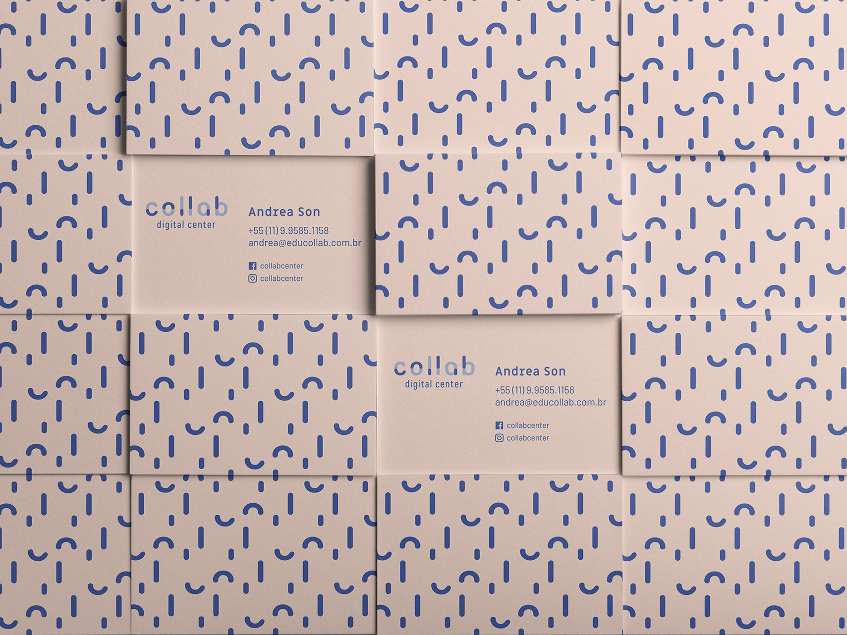
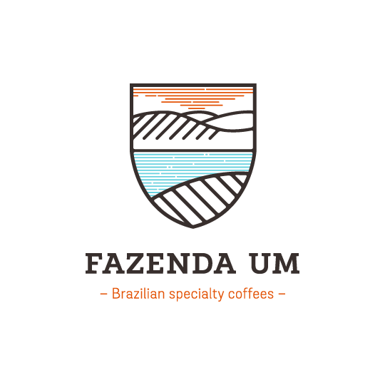
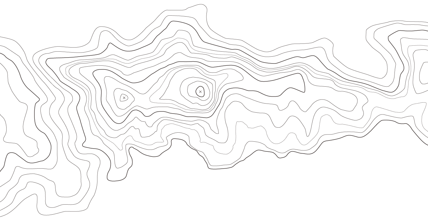
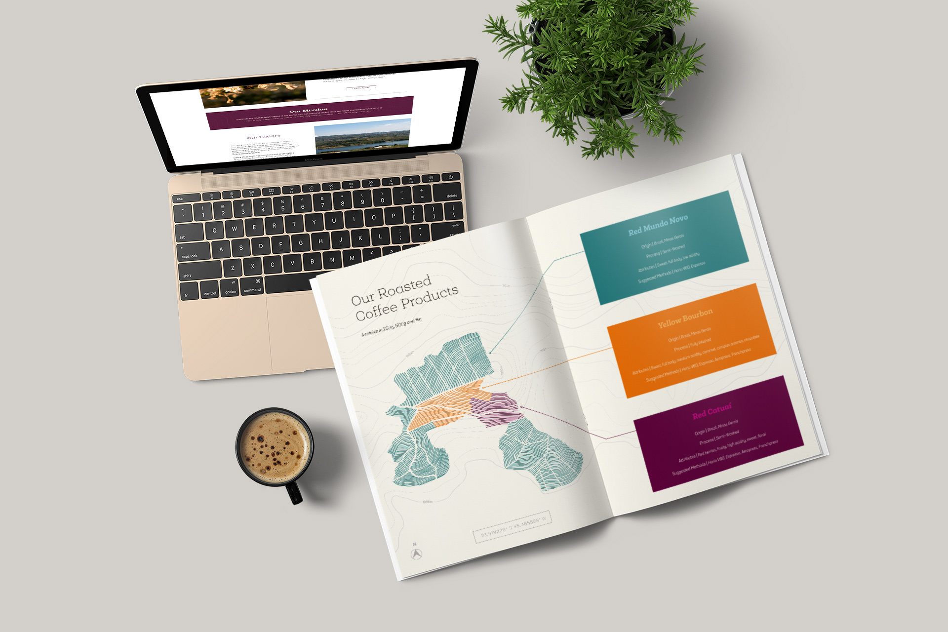
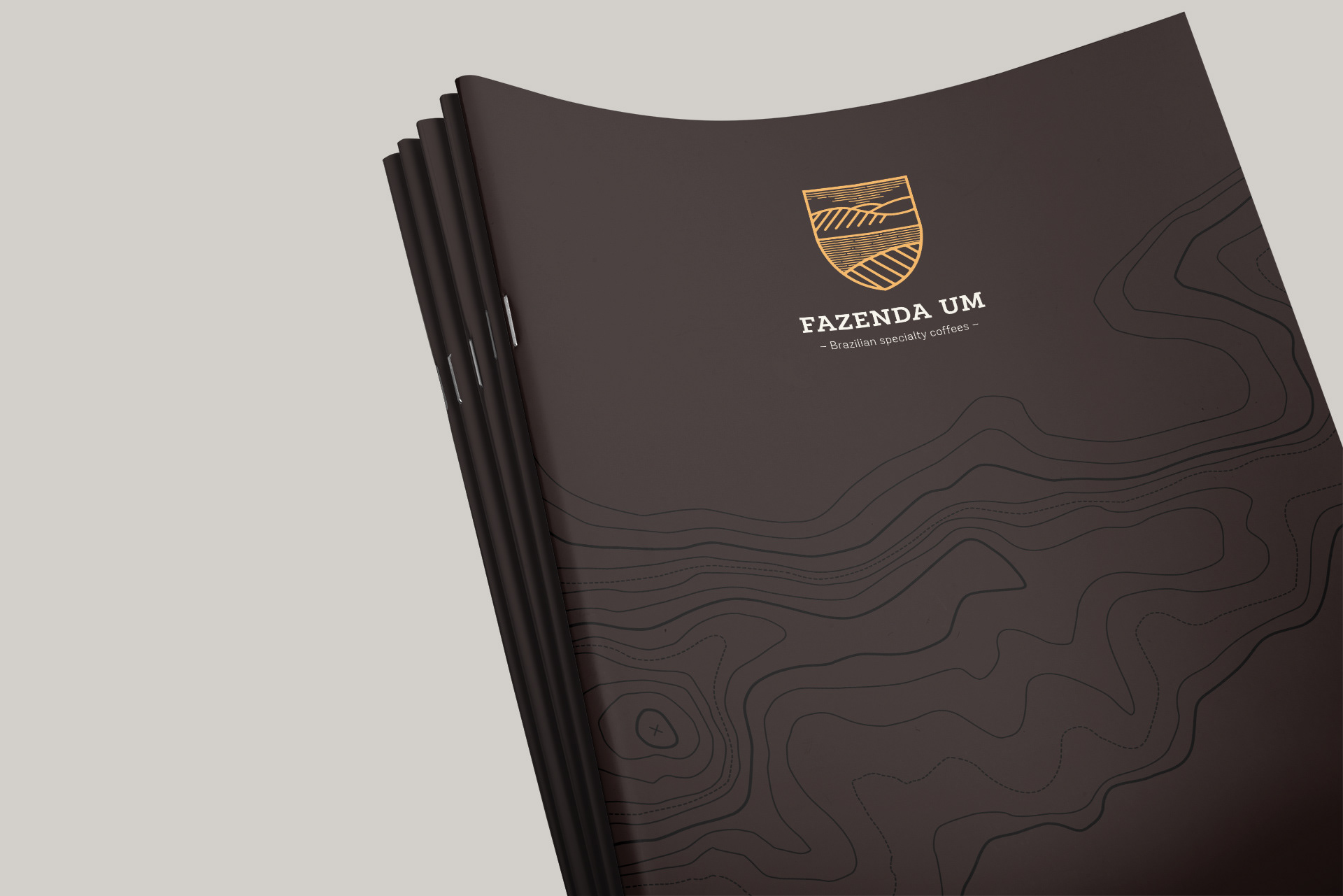
The shield-shaped logo reminds of a traditional family crest, but with a modern twist. Inside it is a rendering of a landscape from the Fazenda Um property itself, with its distinctive body of water. The hilly terrain and the line pattern formed by the coffee fields are a prominent part of the shield: specialty coffee can only be grown under very specific natural conditions, so it was important to incorporate those qualities in the design. That was done not only through the logo, but also through the use of the area's topographic map as a graphic element in the identity. Even the geographic coordinates of the farm were given a prominent spot in the business card, reinforcing the importance of their location.
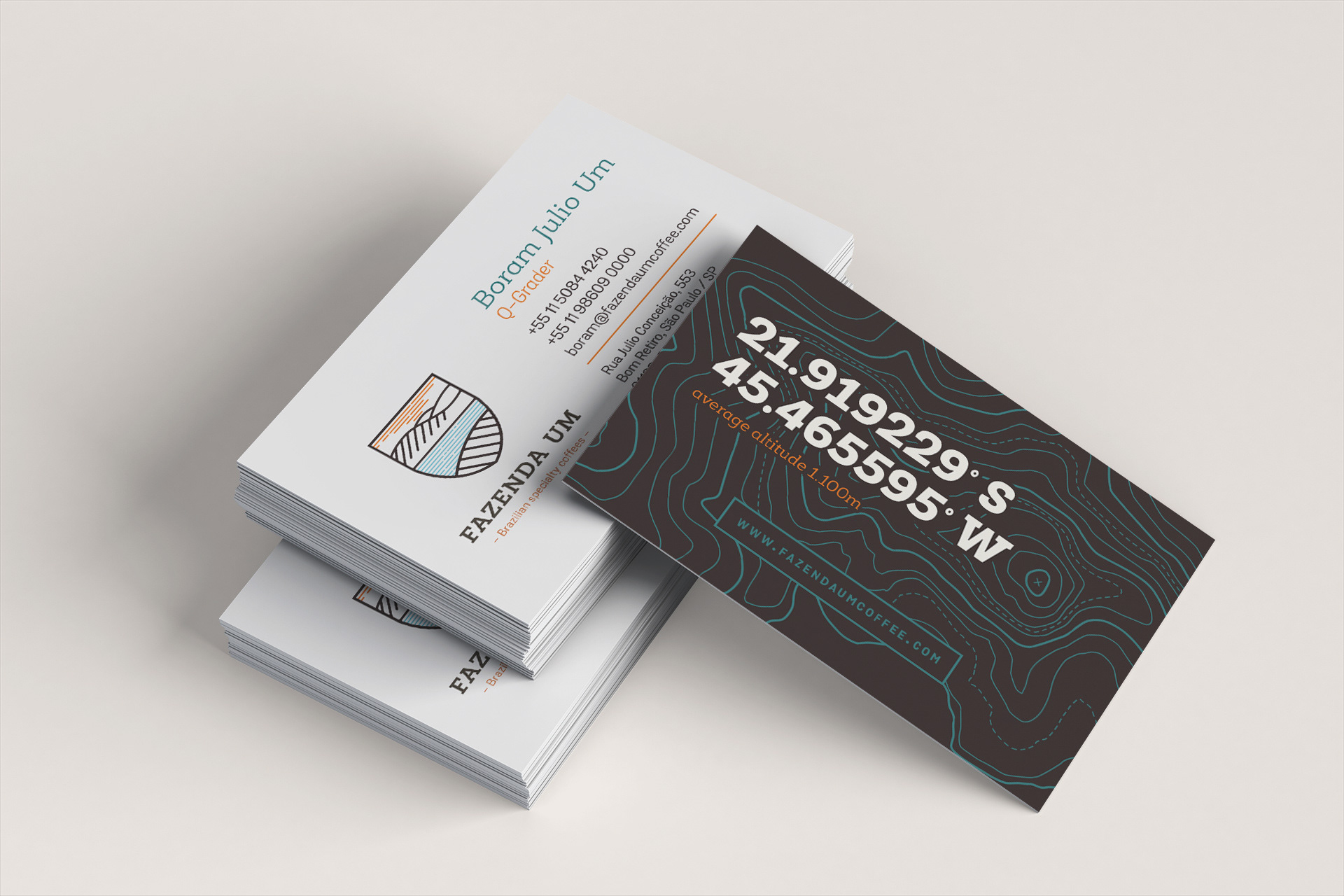
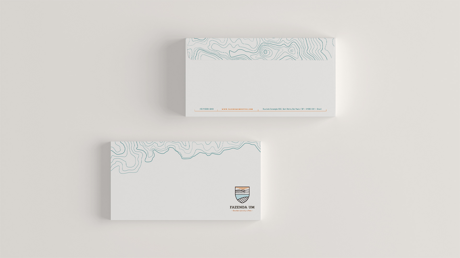


A bold approach
With an extensive color palette that is bold, modern and sophisticated, the Fazenda Um identity sets itself apart from the usual "reds and greens" that populate the looks of other coffee farm brands in Brazil. That was a way to showcase the client's own efforts to bring a more modern approach to coffee farming in the country. The modern style of the export coffee sacks developed for the farm are yet another example of that approach, especially when compared with the typical rustic jute sacks that are the market standard.