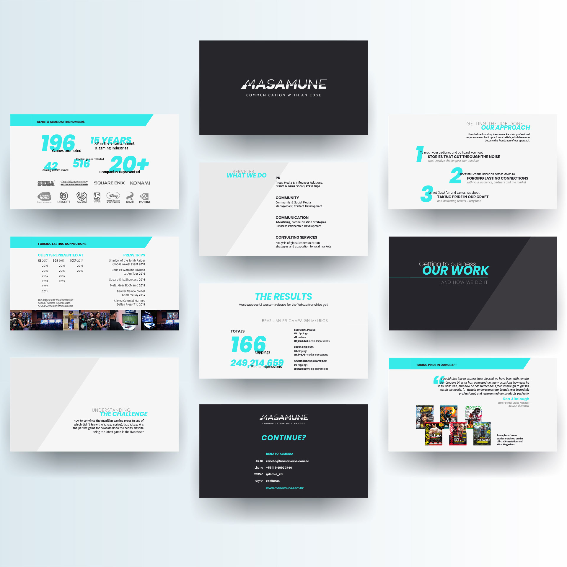
Masamune
// visual identity, presentation
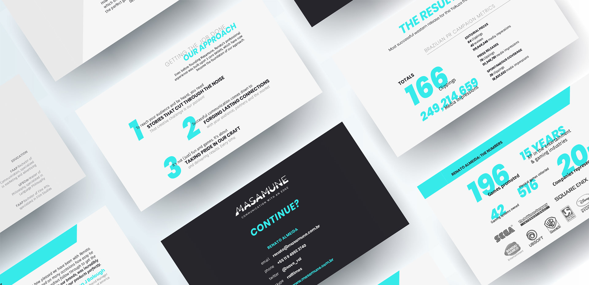
Communication with an edge
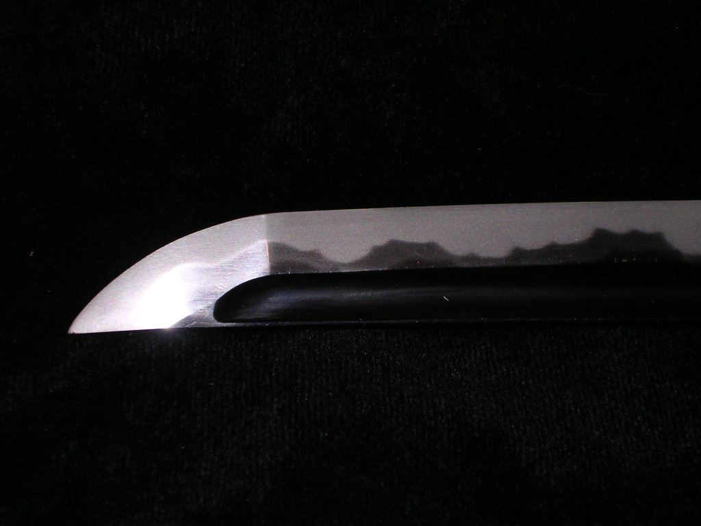
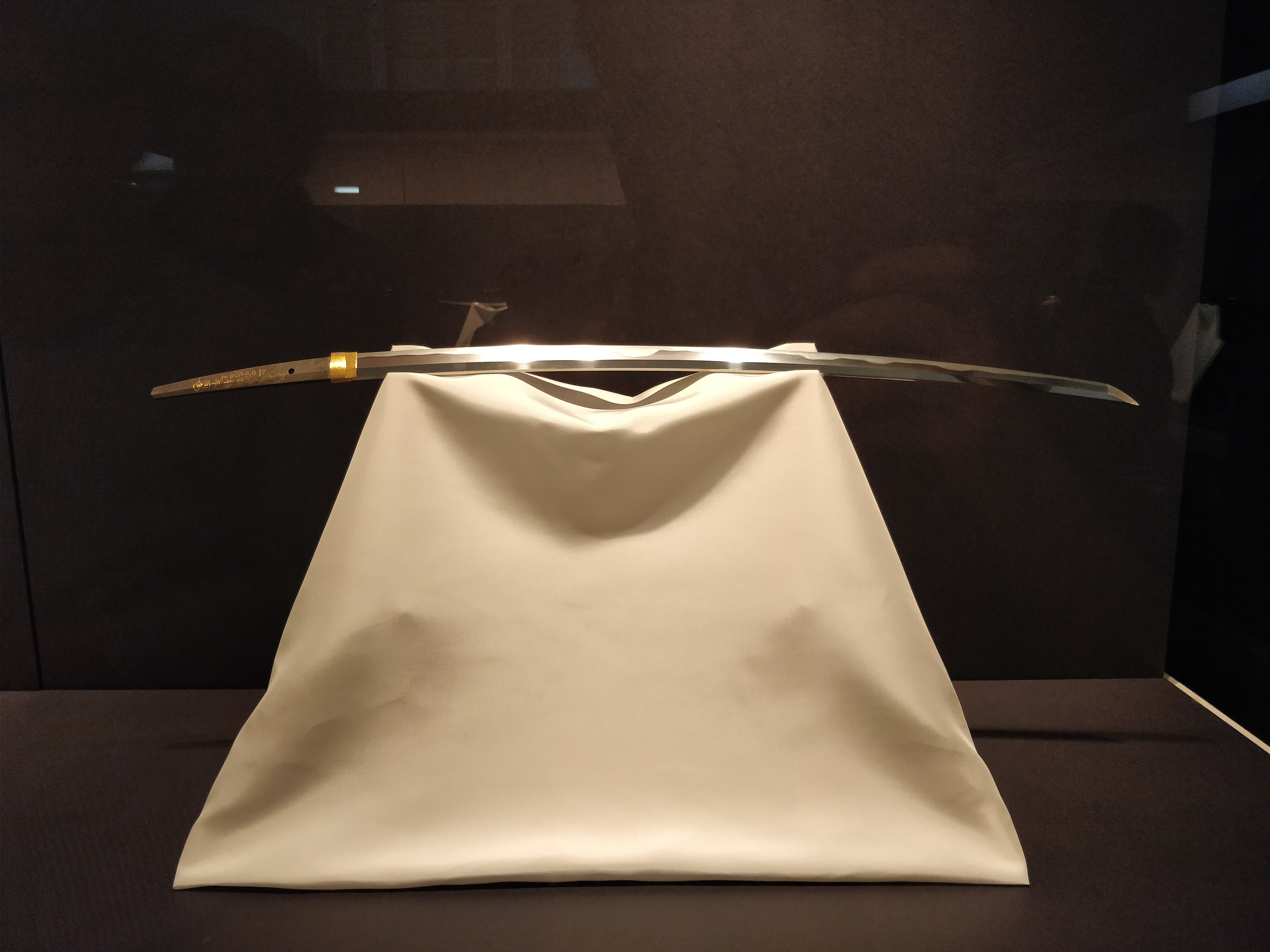
Masamune is a vibrant PR agency that works with many international clients in the games and entertainment industry. Their brand identity and style pay homage to the celebrated blacksmith of Japanese swords Gorō Nyūdō Masamune, representing skill in one’s craft and sharp communication.
A typographic solution
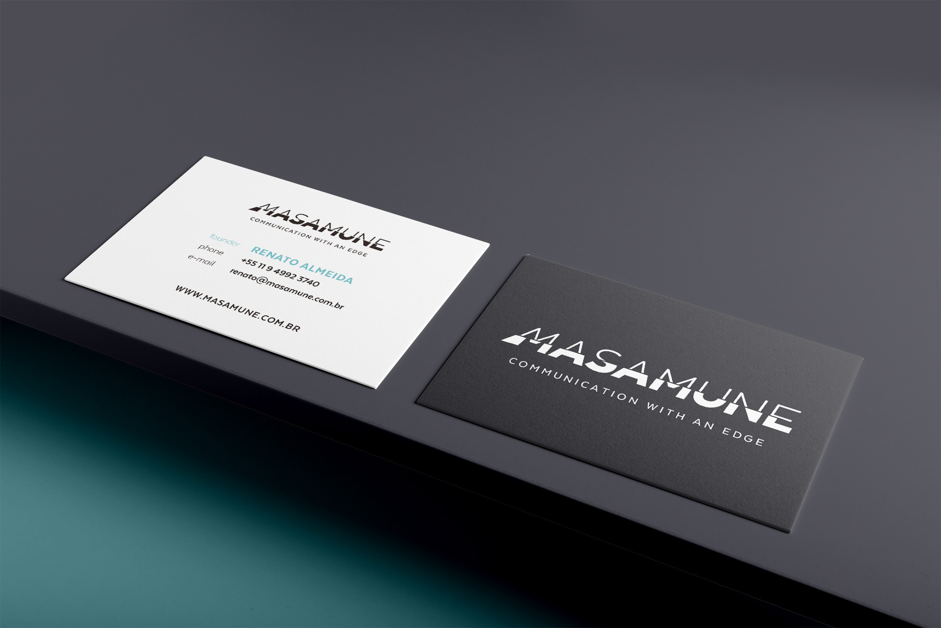
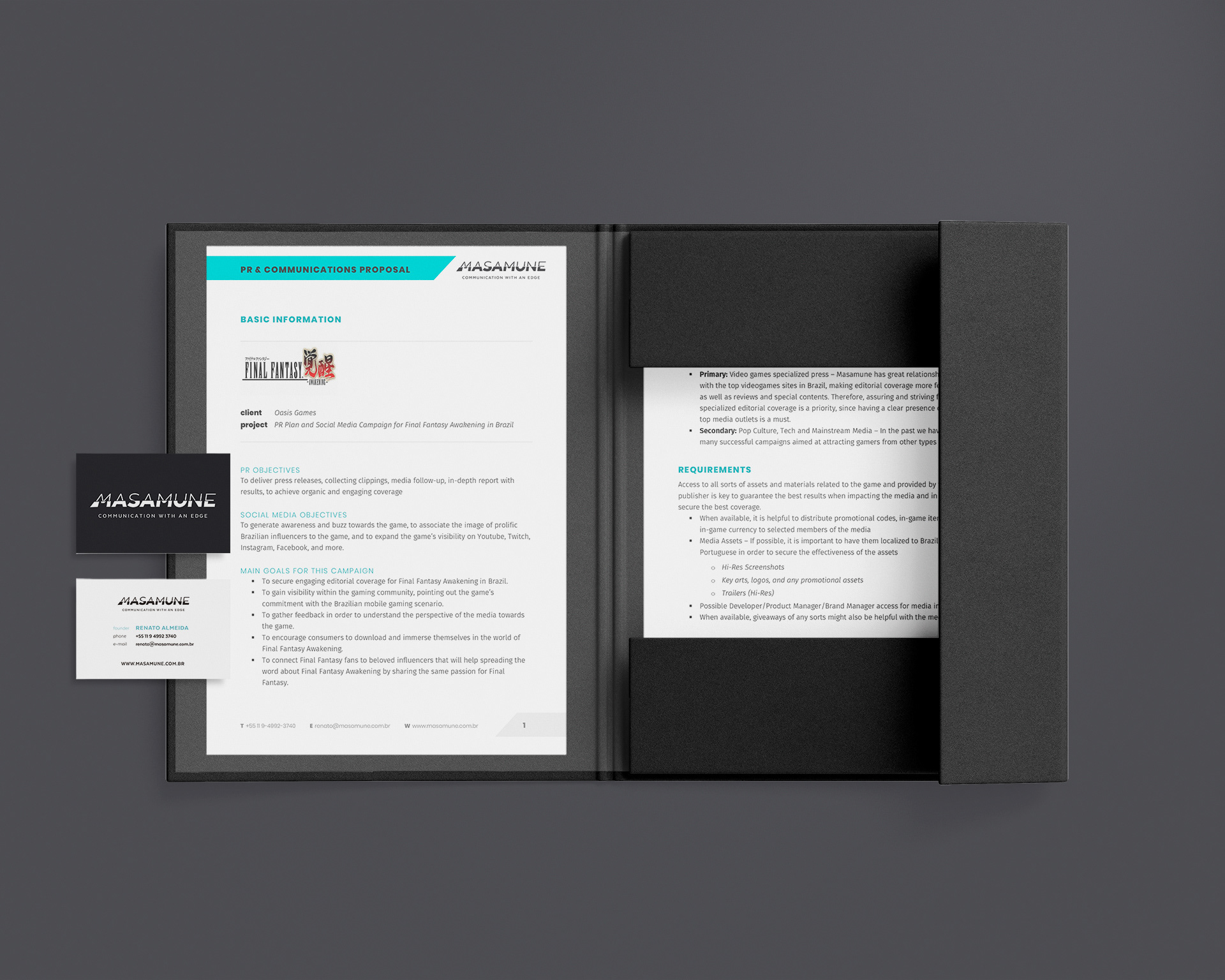
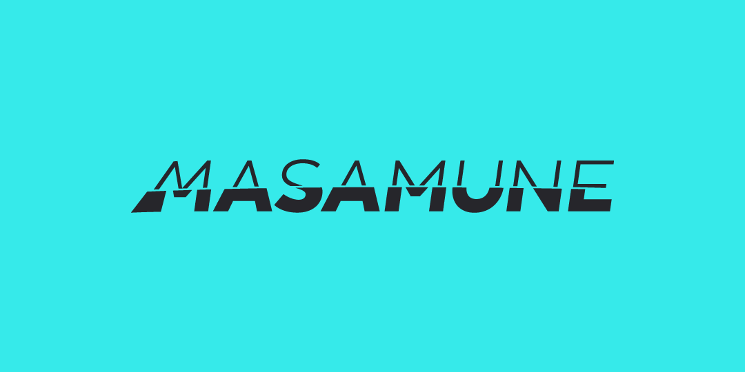
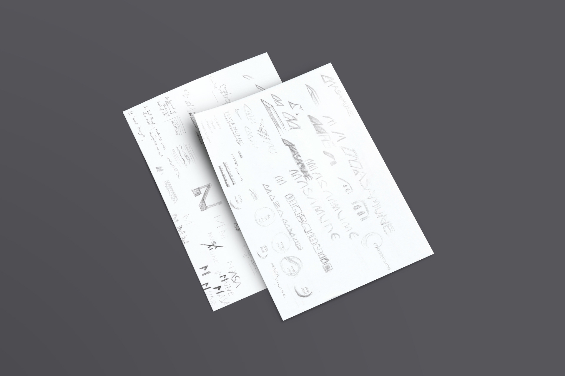
With the name Masamune as a starting point, incorporating swords somehow into the visuals of the brand seemed like too obvious a choice. But that posed an interesting challenge: how to do it then in a non-obvious way? After a lot of sketching and testing, the solution was found in an unorthodox use of typography. By using drastically different weights for the top half and the bottom half of the name, the resulting visual effect was one of a word sliced in half. After the final adjustments were done, one could even draw parallels between the shape of the logo and the distinctive shape of the blade of a japanese sword.


Playing with visuals
For the rest of the visual identity, the idea was combining a very modern, neutral base with accents of bold typography and vibrant color. I wanted to incorporate a bit of the dynamic feel and visual references of videogames in a way that was appropriate for a business that is serious about its work, but also excited and proud of it.