Um Coffee Co.
// art direction, visual identity, branding, webdesign, packaging, signage, copywriting
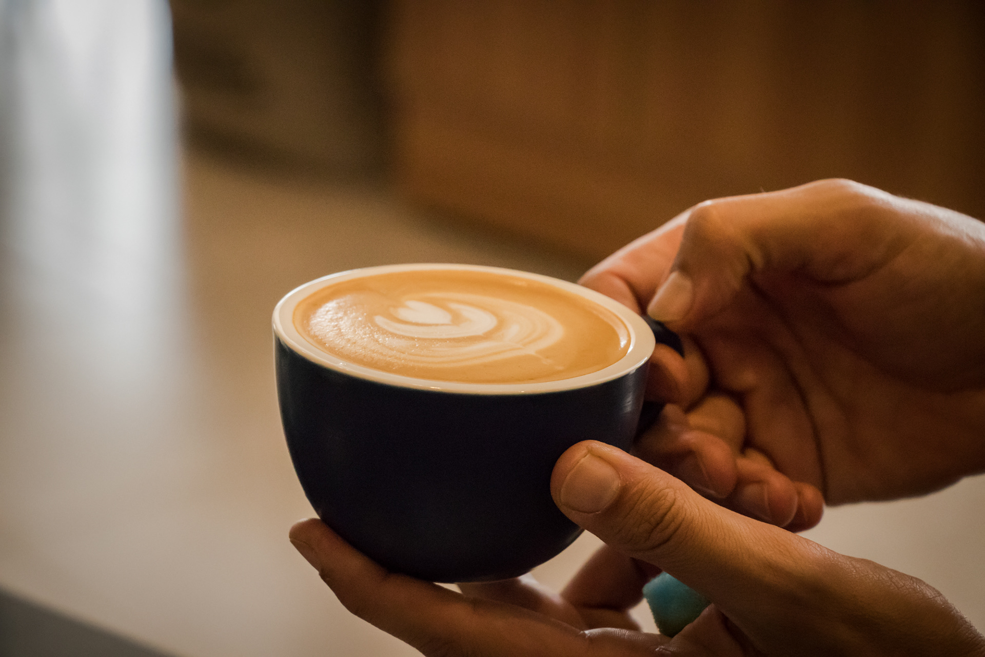
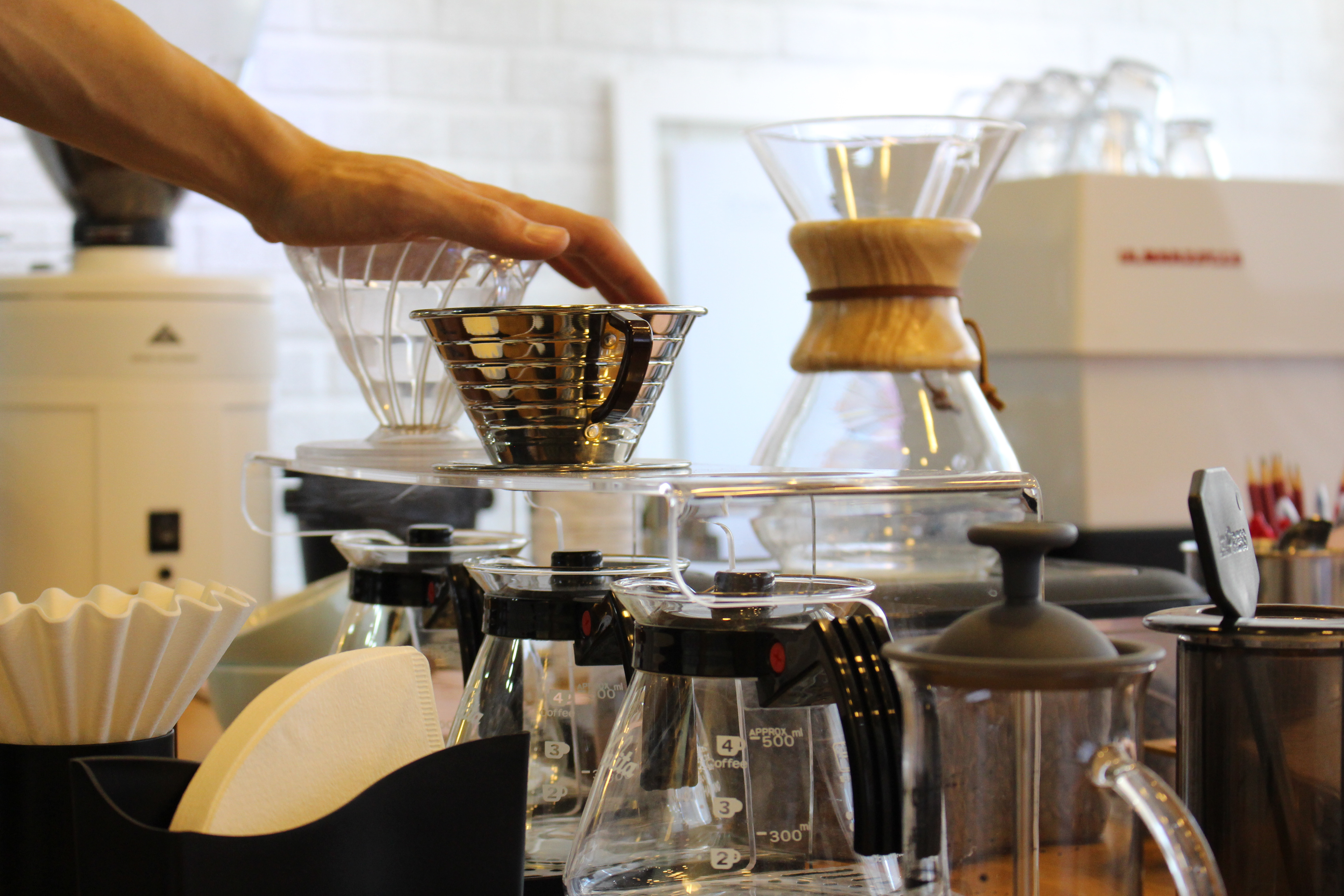
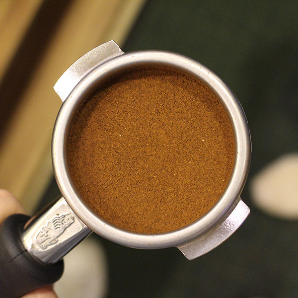
A passion for coffee
Um Coffee Co. operates in a number of different fronts to promote specialty coffee culture in São Paulo and Brazil: they are a roastery, they run their own cafés, and they are also an education hub to both enthusiasts and professionals in the field.
They always had the ambition to be the number one reference for specialty coffee in the country. My goal, throughout the several years of our partnership, was to make them also look the part. In 2019, Um Coffee Co. was voted best coffee in São Paulo for the second time.
South-Korean inspiration
The business was heavily inspired by coffee culture in South Korea, where the clients' heritage lies. The brand design was also influenced by those references, with their clean lines, modern aesthetic and neutral tones. That helped the brand stand out from the competition as well, setting Um Coffee Co. apart from the typical spectrum of farmland-rustic vs. traditionally-elegant looks that dominated the Brazilian coffee market.
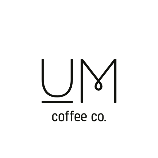
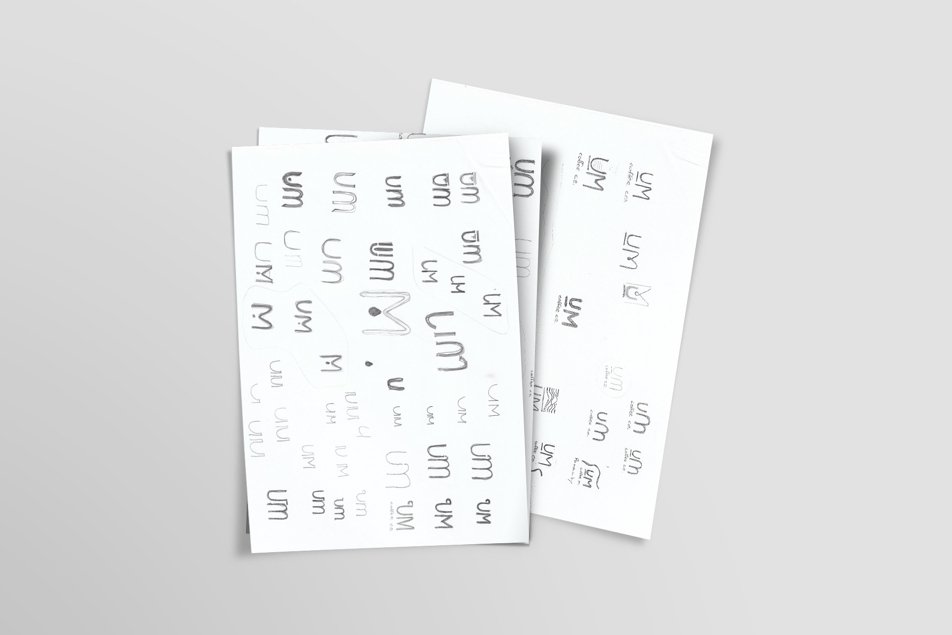
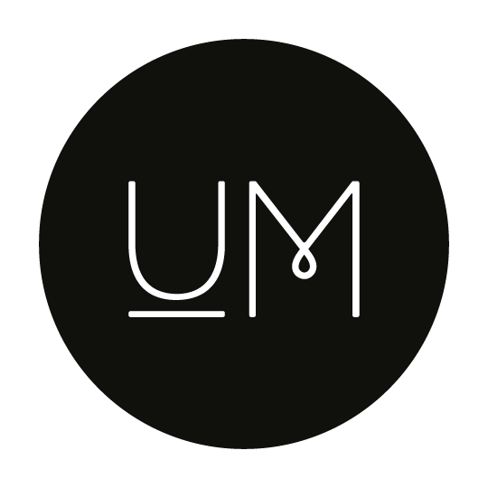
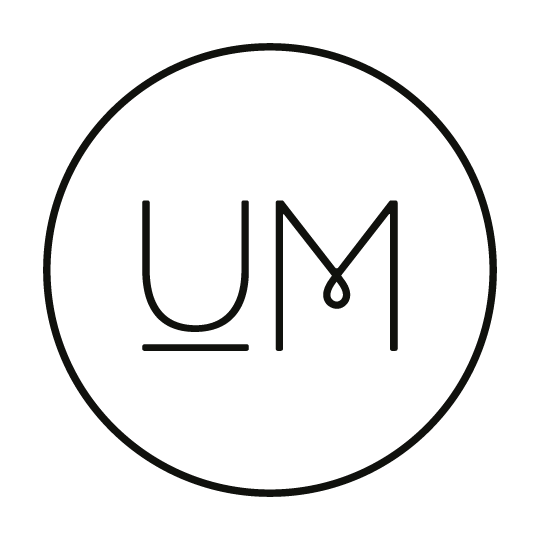
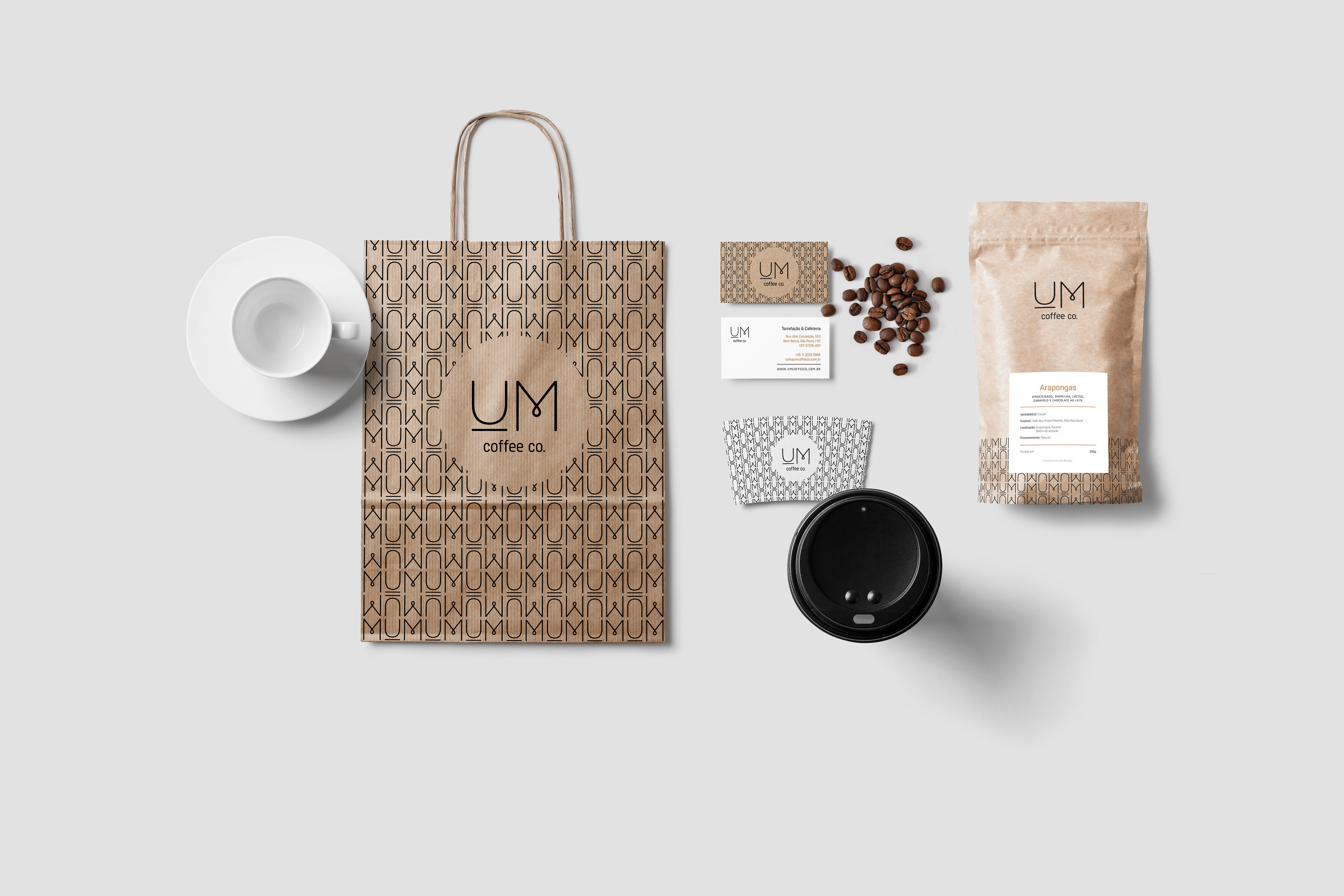
The "Um" that gives the company its name comes from the owners' own Korean last name. I wanted the logo to be very straightforward, but also subtly integrate visual references to the coffee world in its design. It took a fair amount of sketching for the "U" and the "M" to reach their final forms, reminding of a cup with a saucer underneath and a drop about to drip from a coffee filter, respectively.

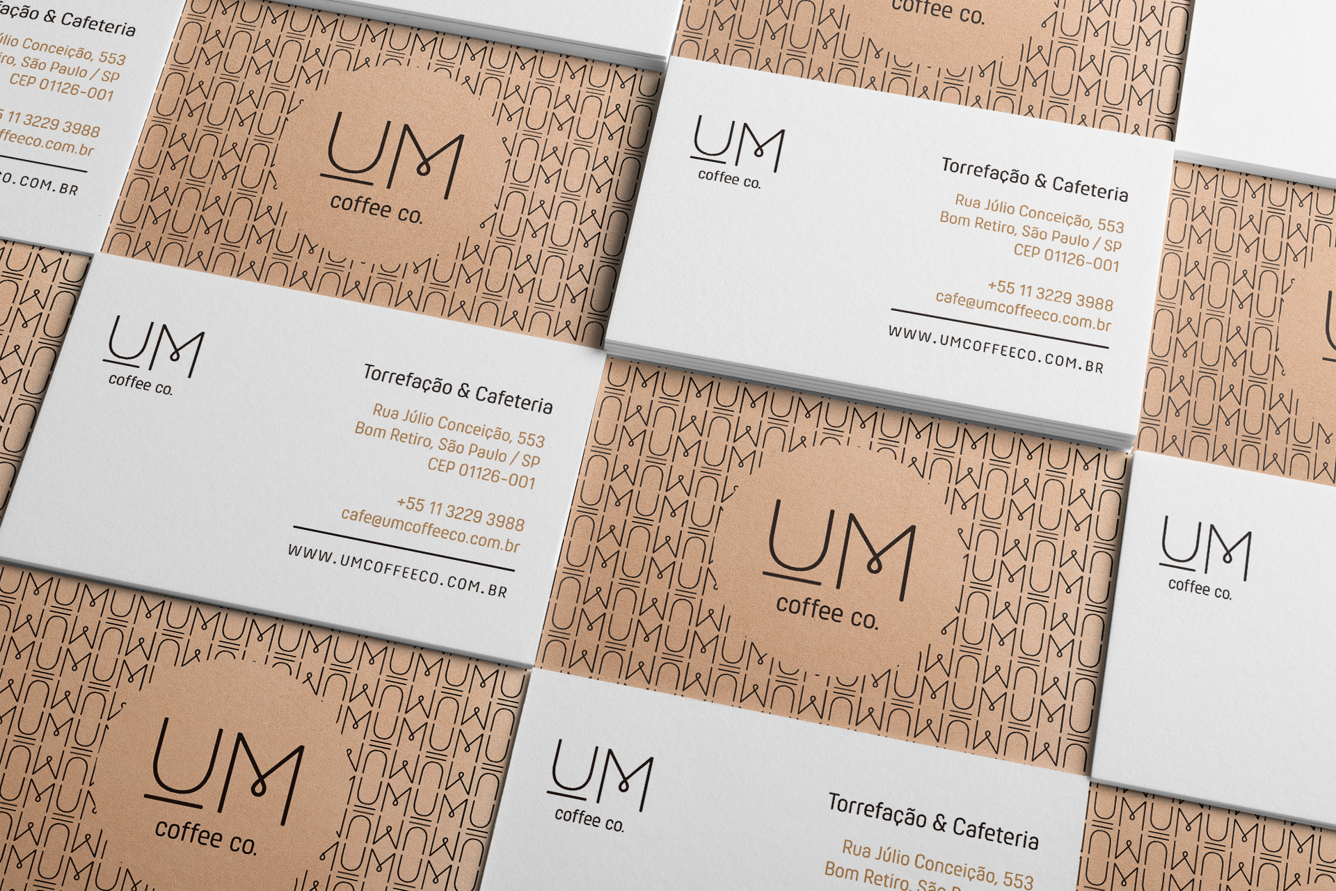
A complete package
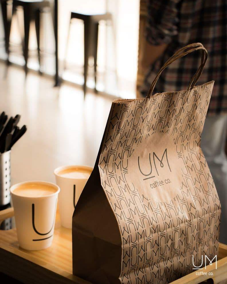
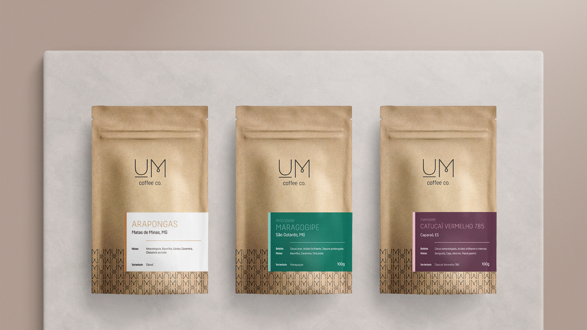
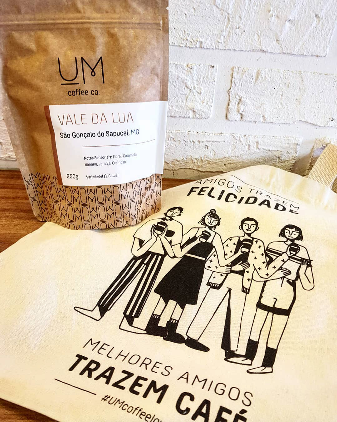
One of the exciting challenges in developing the identity for Um Coffee Co. was to take into account the vast range of applications they would have. Thinking about their coffee packages, for example, was part of the creative process from the very beginning. The options available in Brazil for packages that could preserve the quality of the coffee to the extent the clients wanted were extremely limited. So it was important that the design took those constraints into account while still delivering a solid visual presentation of their brand.
The brown paper package with the black logo and pattern remains since the creation of the visual identity, but the label has changed throughout the years to make the packaging stand out more on the shelves. During this process I also created an additional color palette to be used for limited edition coffees, providing a diverse range of color combinations for Um Coffee Co.'s range of more premium products.

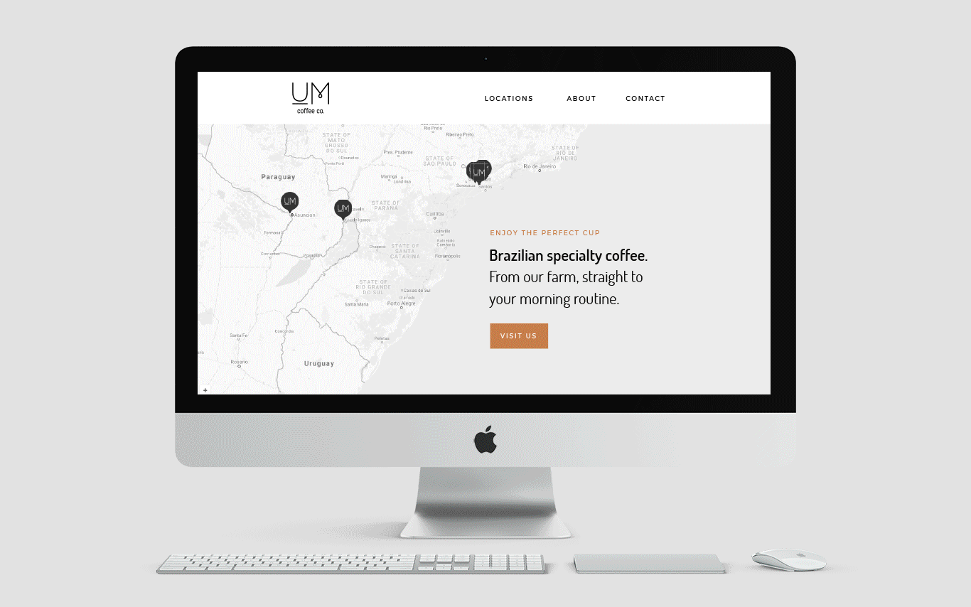
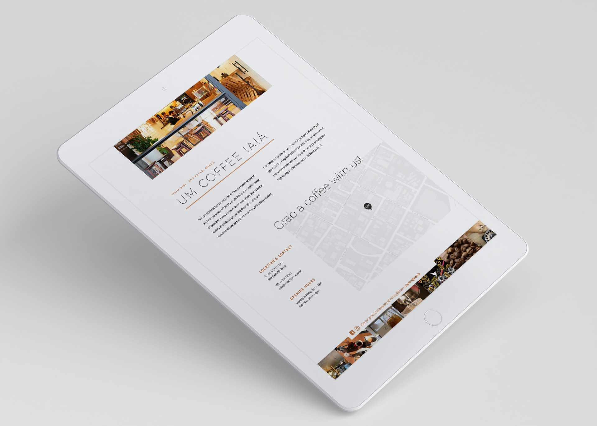
Two moments, two webdesign solutions
Soon after delivering their full visual identity package, I also developed the Um Coffee Co. website, following the same style. And two years after that, their business was expanding to other countries in South America. I designed a second website for them then, with an updated look and a focus on the international market: it was an opportunity to incorporate new elements that had been added to the visual identity throughout the years, such as additional display typography, hand-made illustrations, etc. I was also responsible for creating the written content on both websites.

Increasing the scale
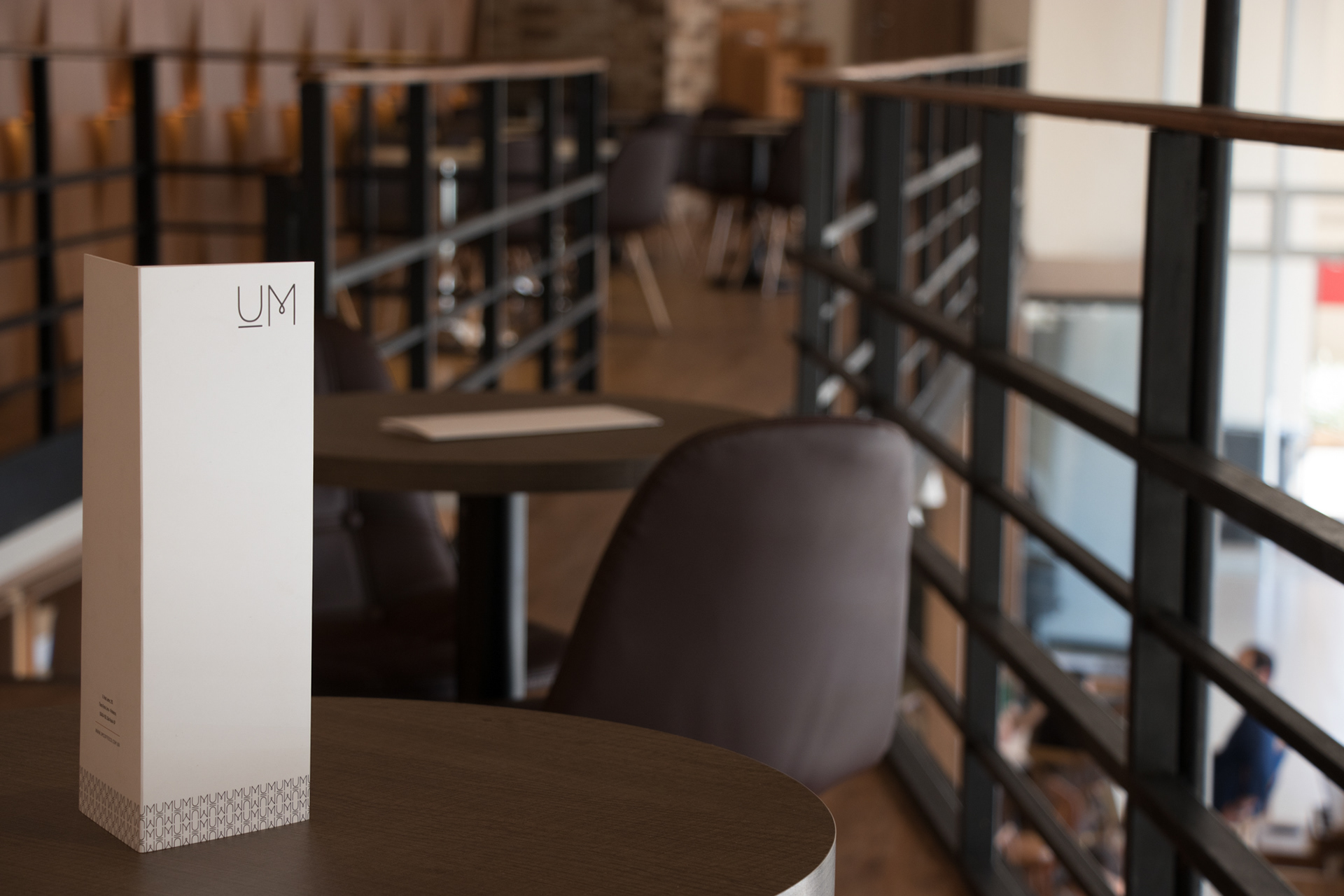
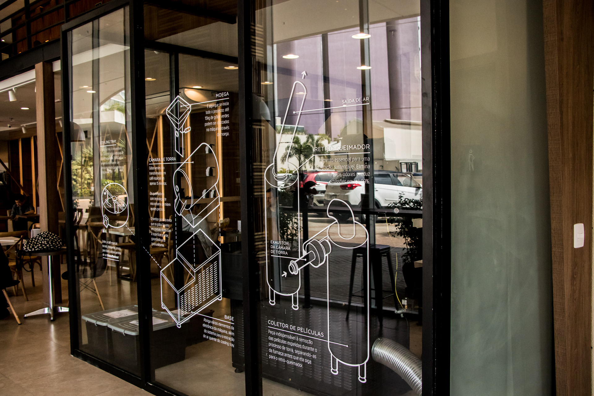
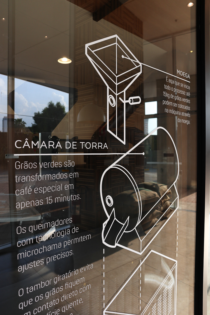
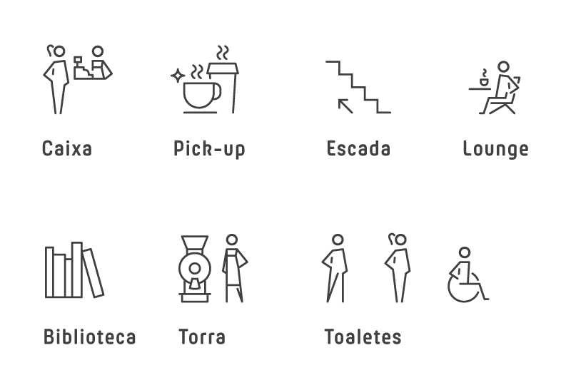
From the creation of instagrammable quotes and decorative diagrams for their walls to full menu boards and signage featuring exclusive icons, there were several design pieces made to complement the interiors of the many Um Coffee cafés in São Paulo.

Art direction
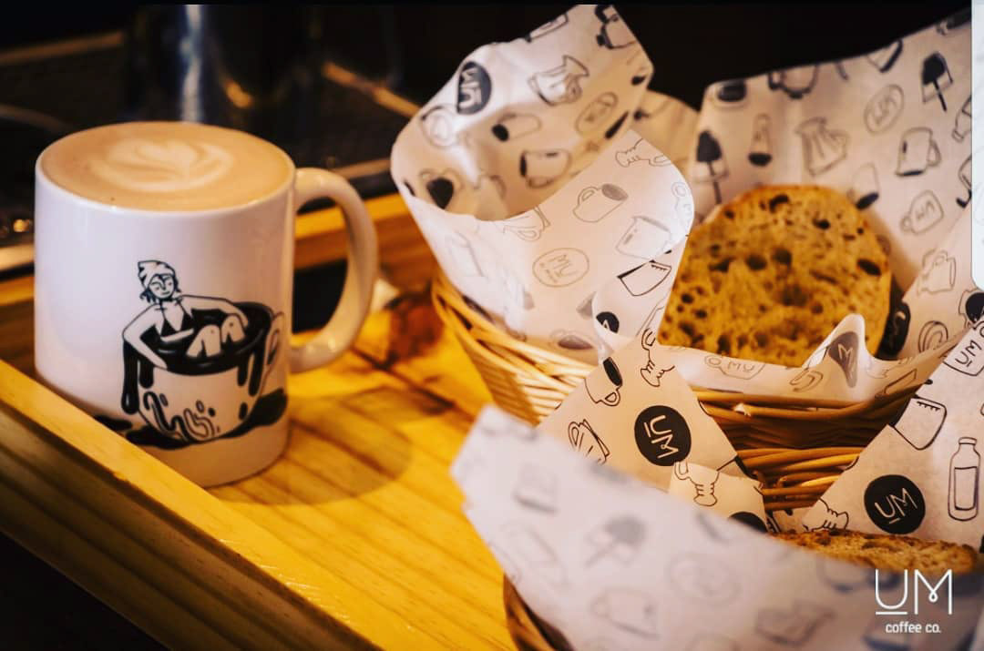
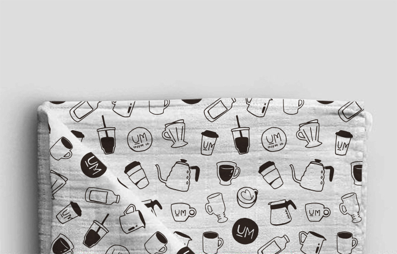
The clients wanted a line of products to sell on their cafés and webshop. I was responsible for the art direction of their merchandise, creating the quotes, patterns for bandanas/napkins and the layouts for their mugs and tote bags. This project included handmade illustrations by Brazilian artist Paty Baik.

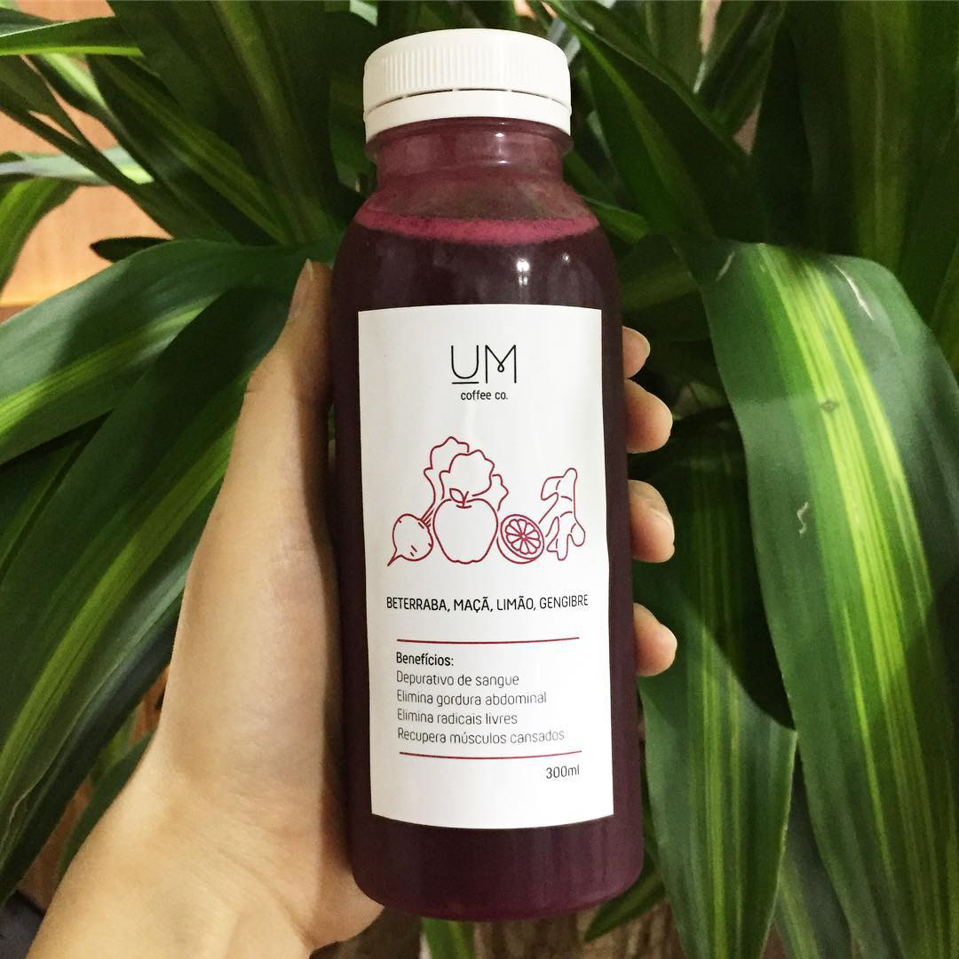
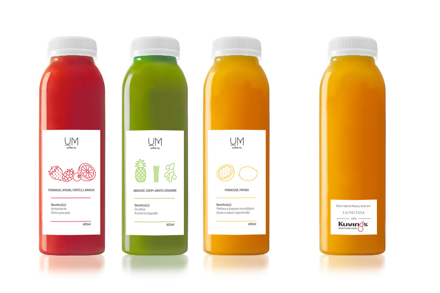
Beyond the cup
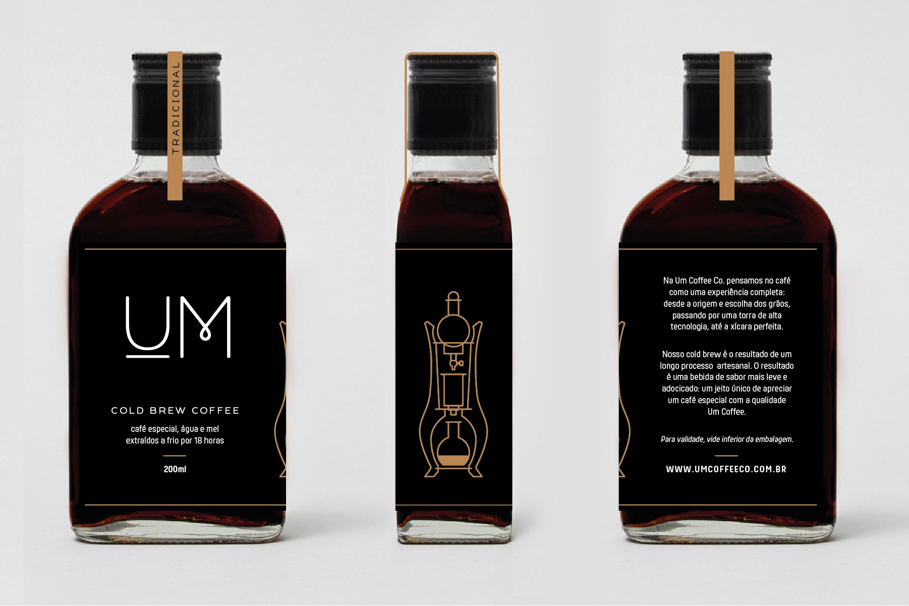
The Um Coffee Co. cafés also make and sell other drinks, such as freshly-made cold-pressed juices and bottled cold brews. Each one of those products had their labels designed to to perfectly match the signature minimalist style of the brand, with accompanying custom-made icons and illustrations.
A place of learning
Um Coffee Co. eventually needed a separate sub-brand for their workshops and courses: and thus, Um Coffee Academy was born. Its style followed the clean lines of the main brand, with the addition of a simple blue color palette and a solid typography, for some extra weight and a feel of reliability. For this project, I also created a small set of accompanying custom-made icons.