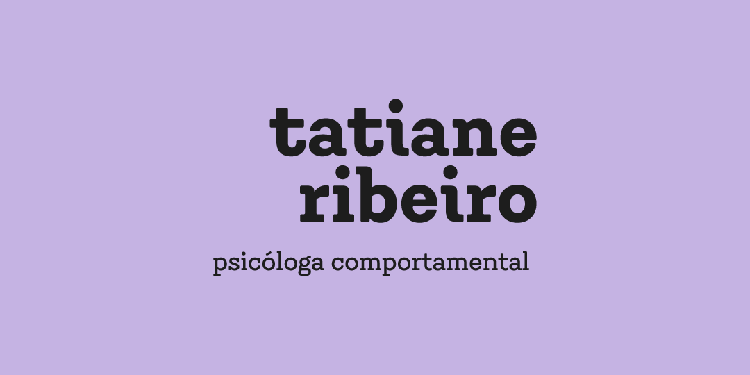
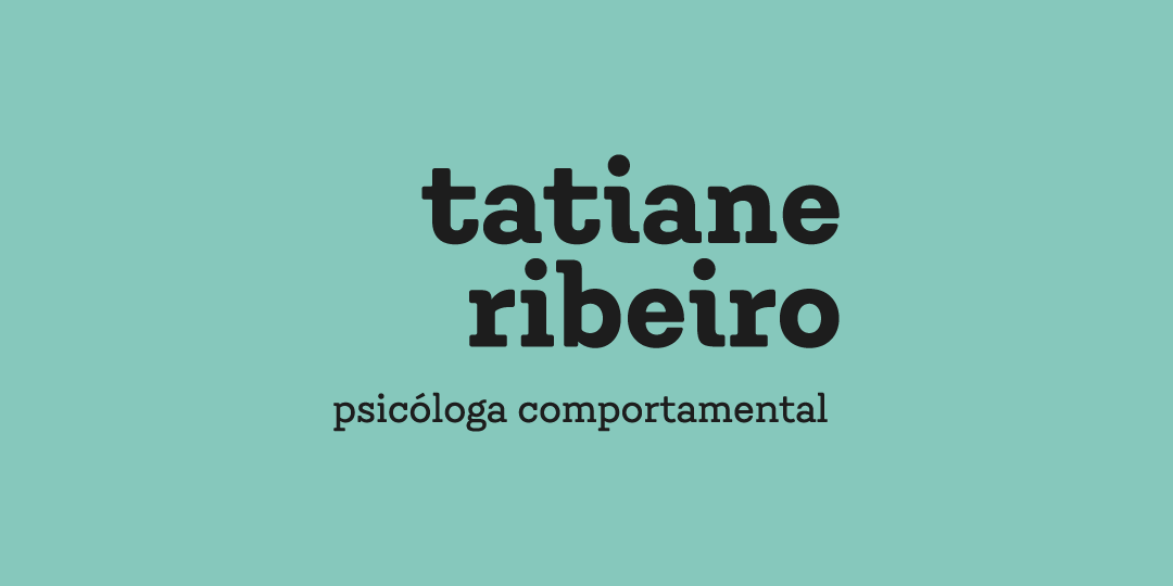
Tatiane Ribeiro
// visual identity, illustration

The briefing
This psychology practice caters to autistic children from 0 to 6 years old. After remarkable growth in their business, they were looking to redesign their brand identity to something more professional, while also avoiding an overly clinical look.
Playfully professional
The main challenge for this project was finding the balance between the lightness required in dealing with children and the seriousness of the work being done.
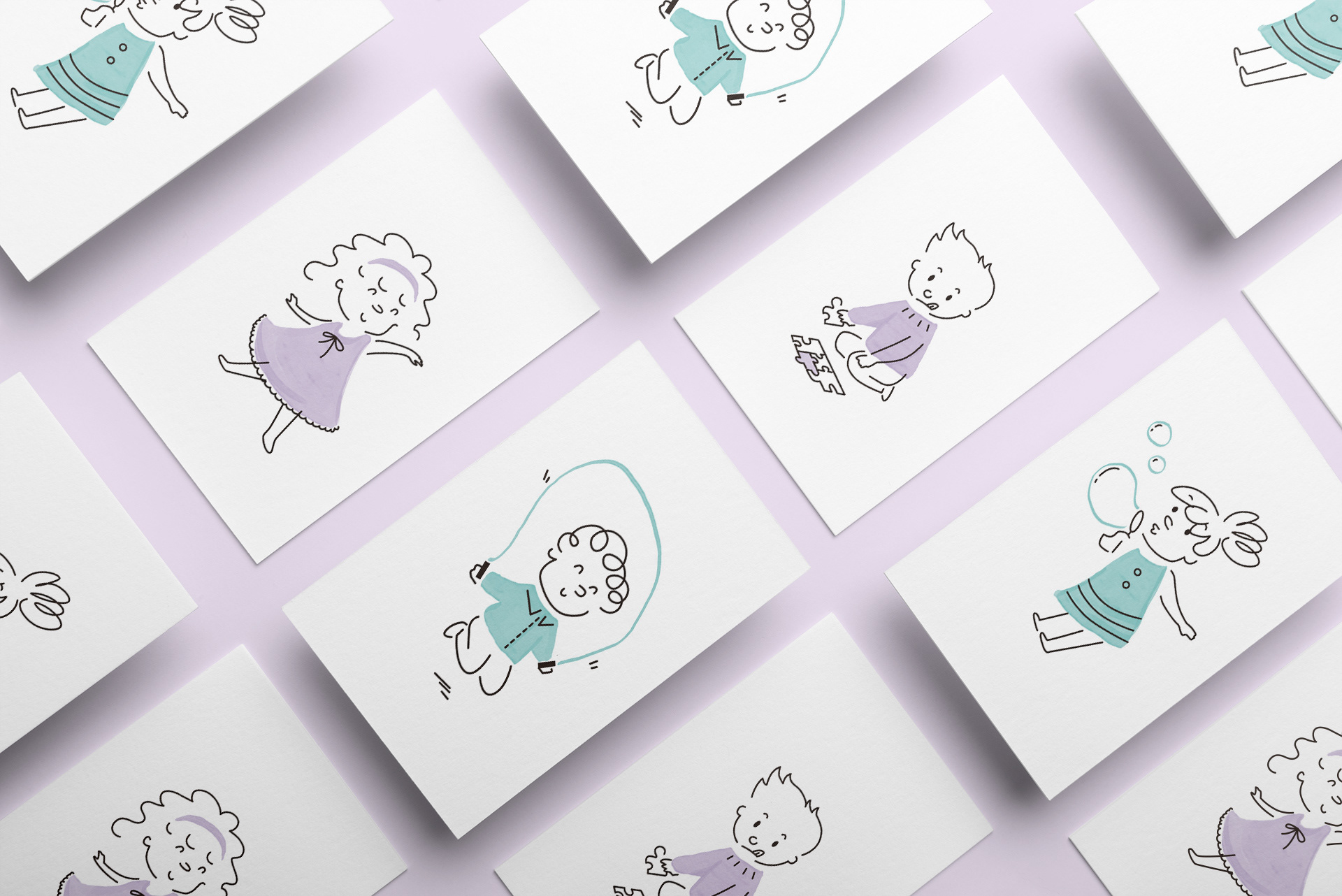
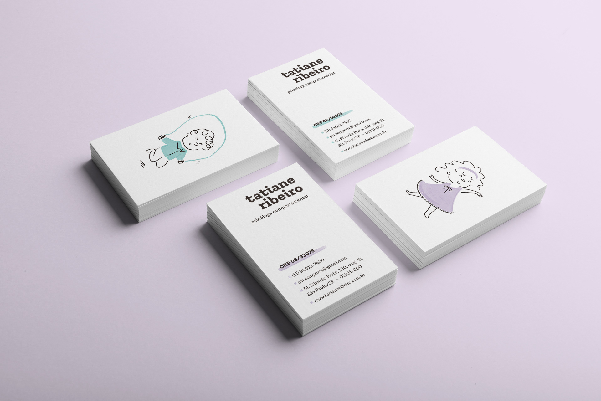
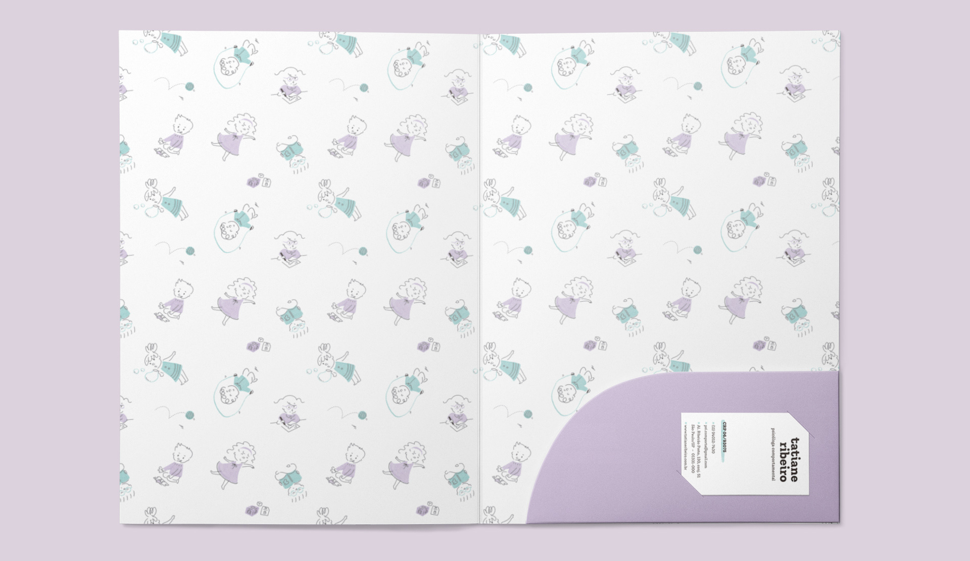
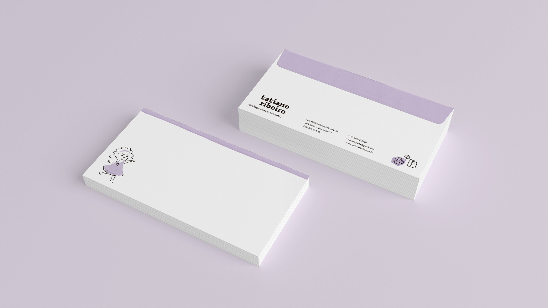
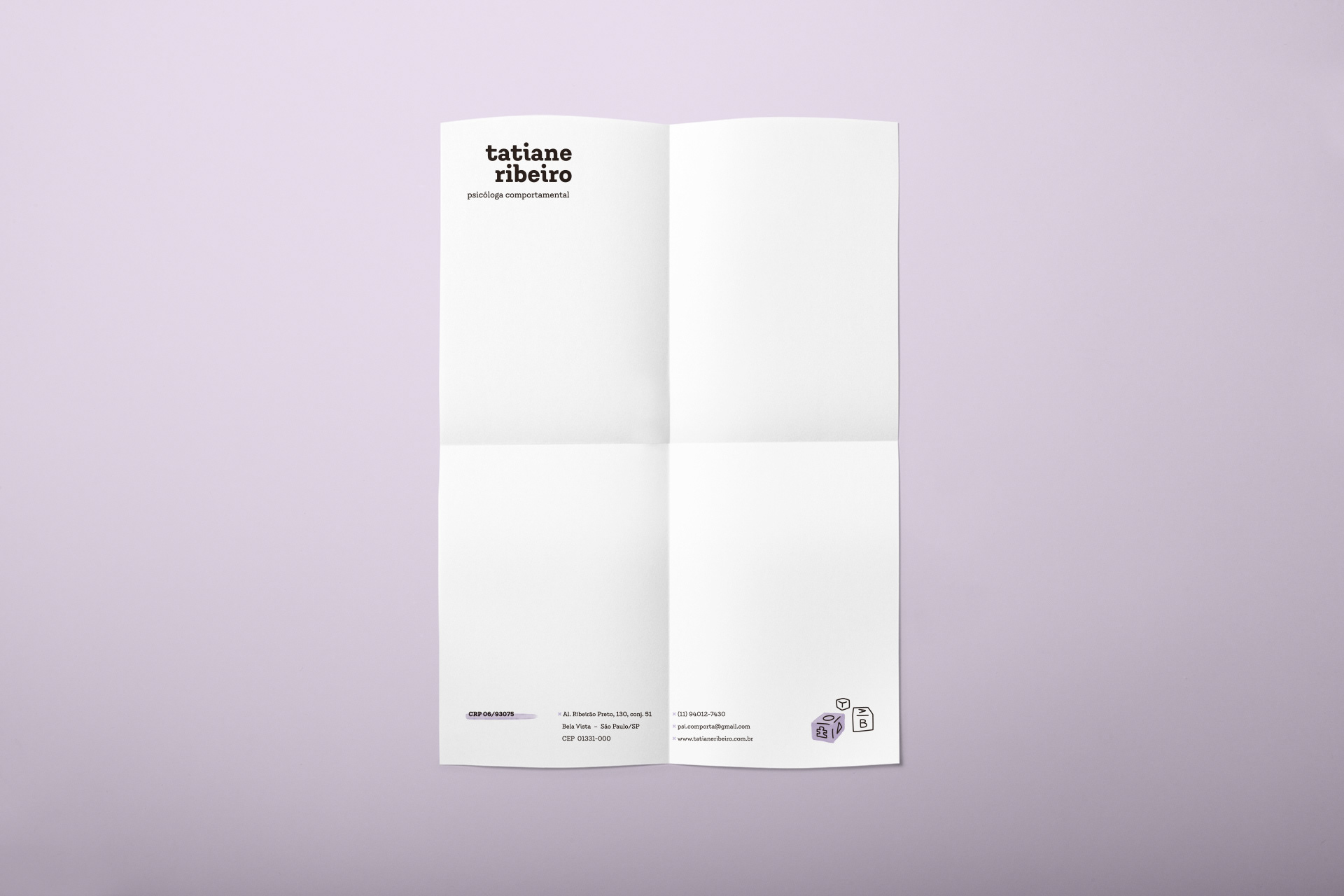
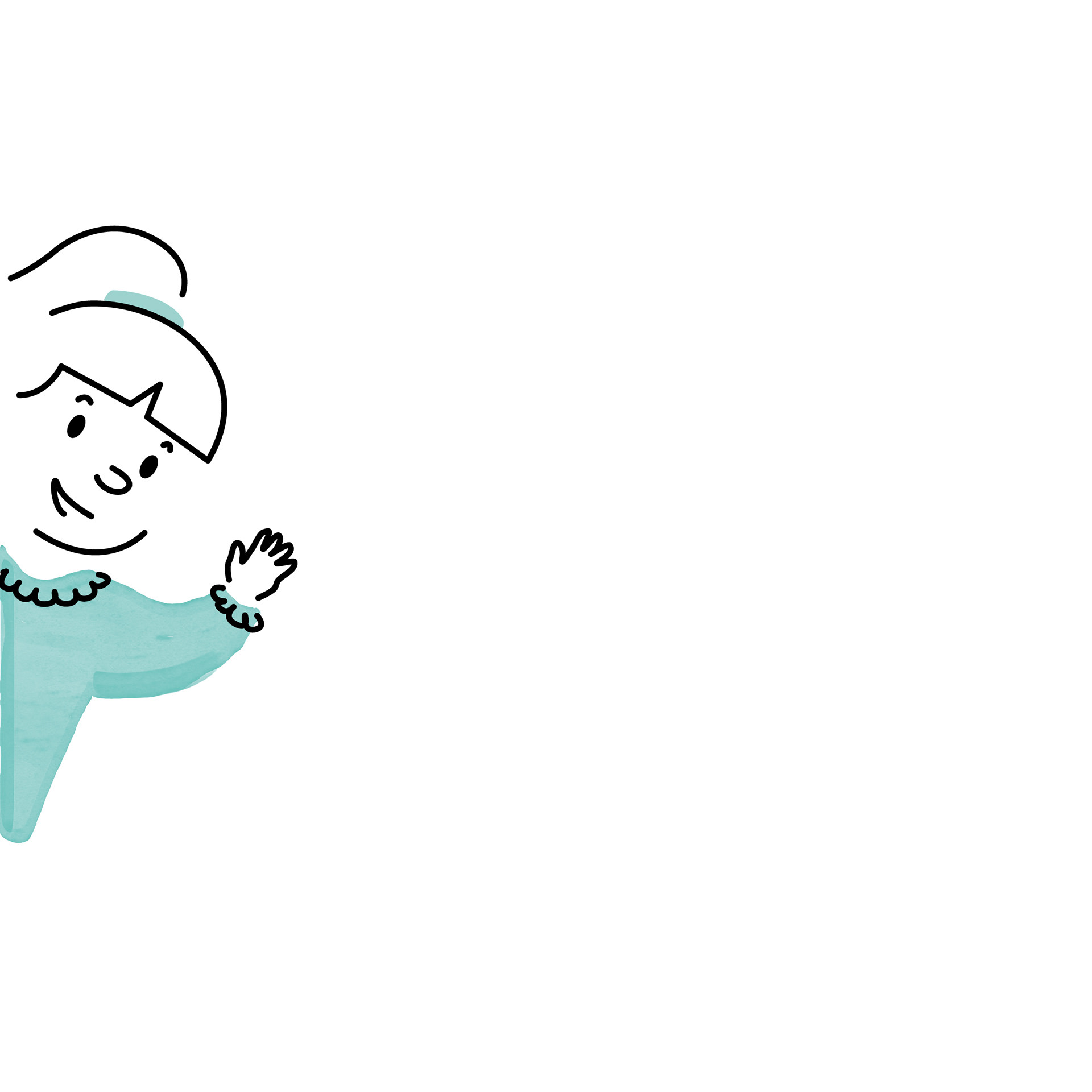
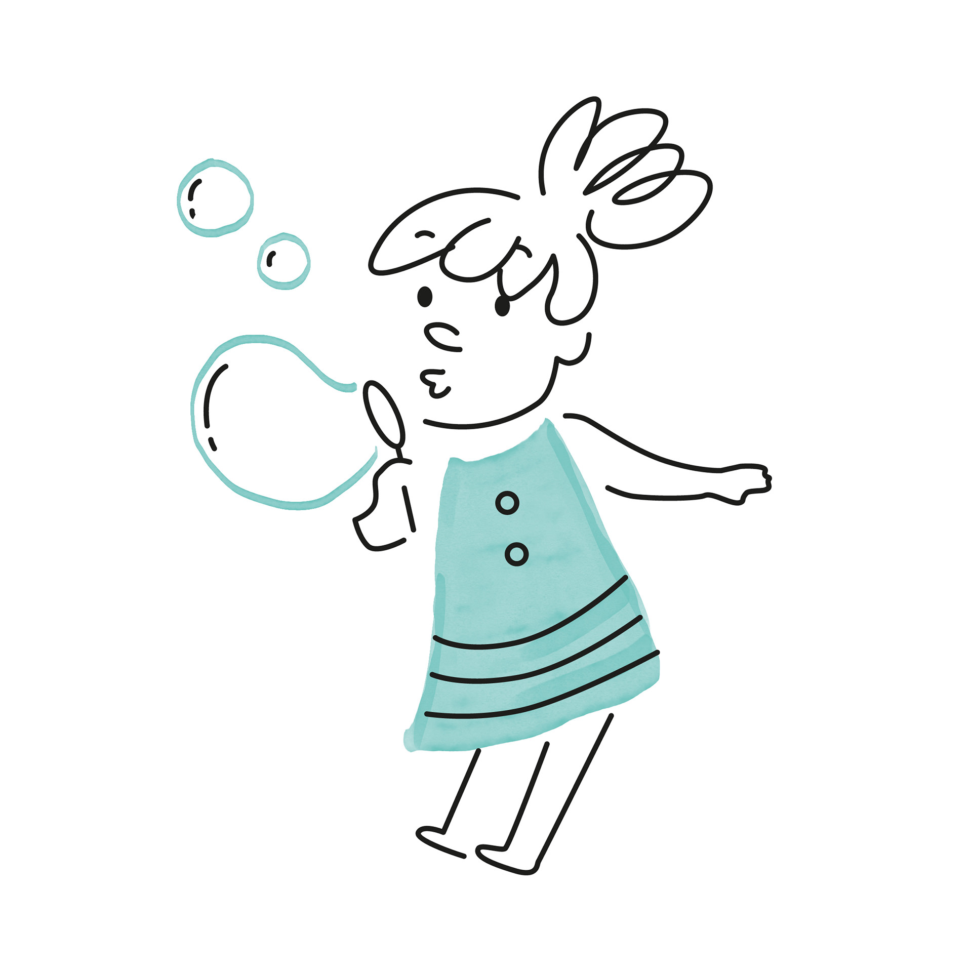
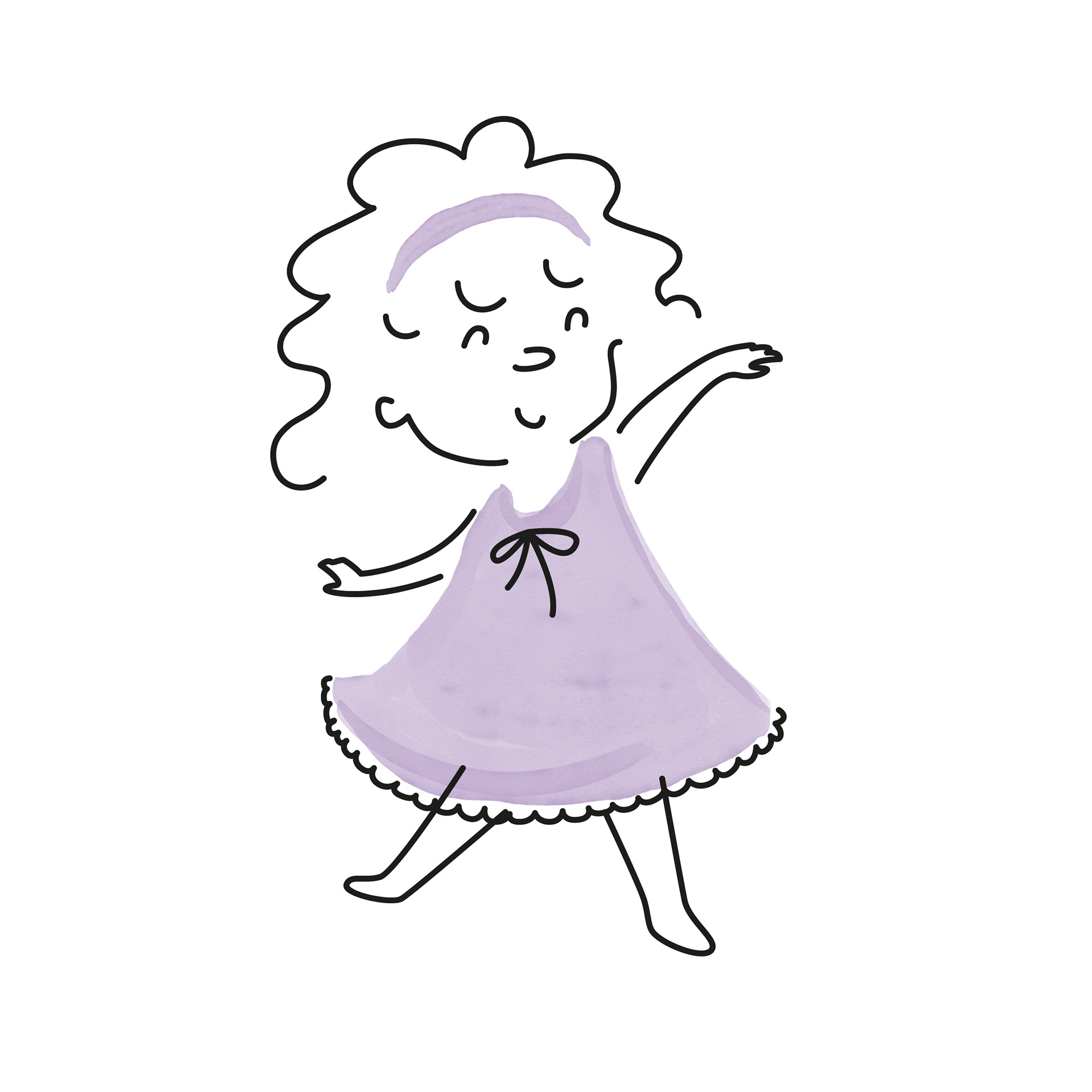
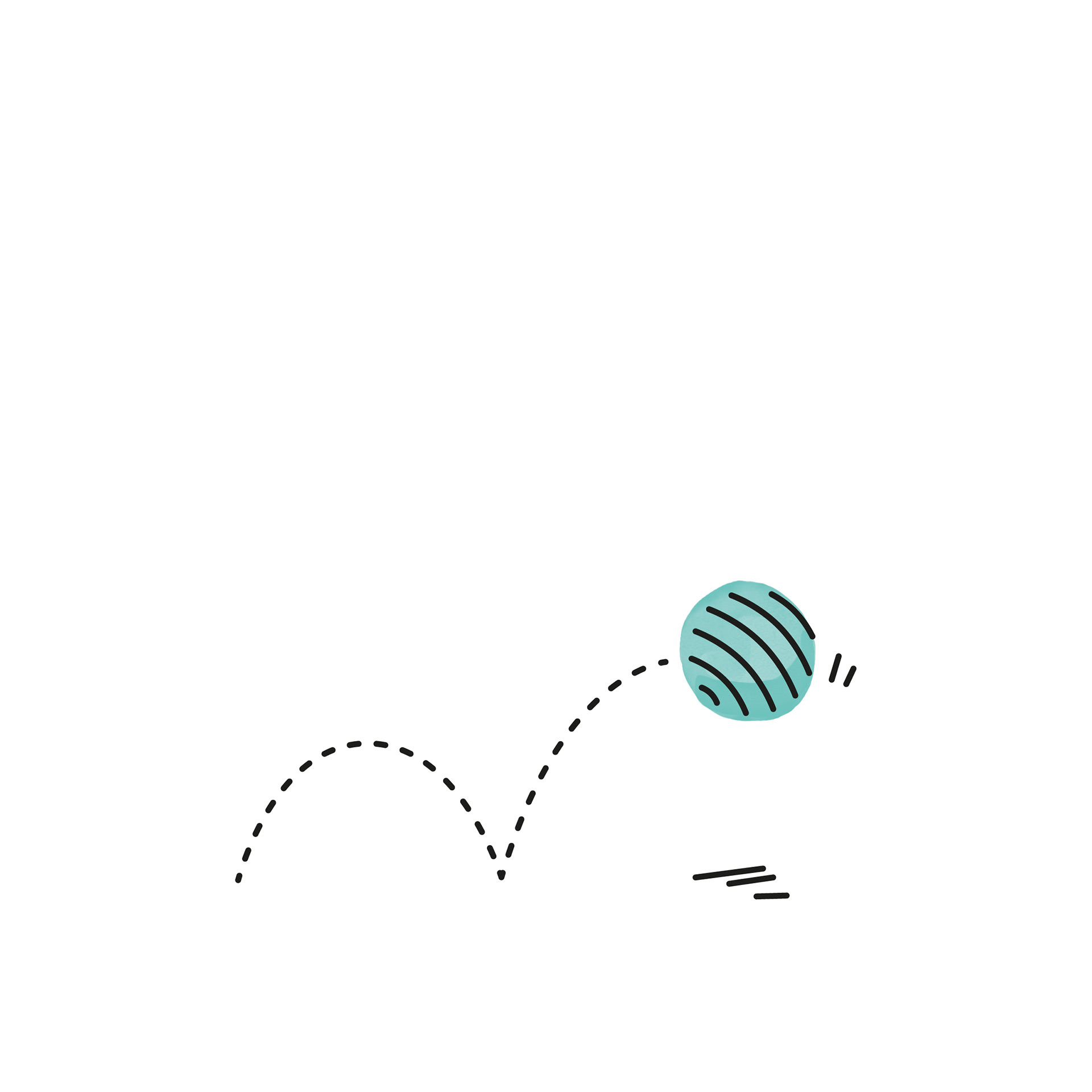
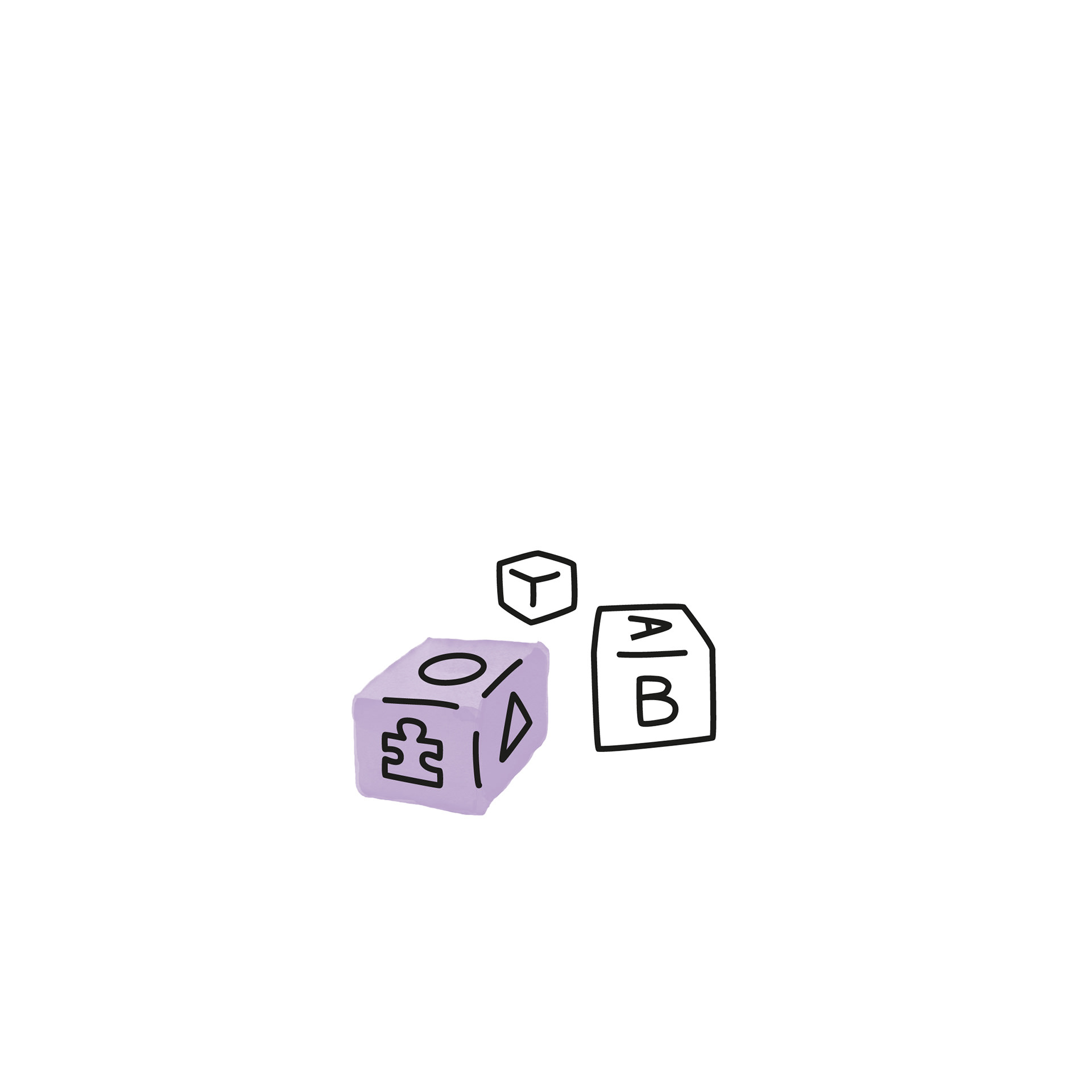
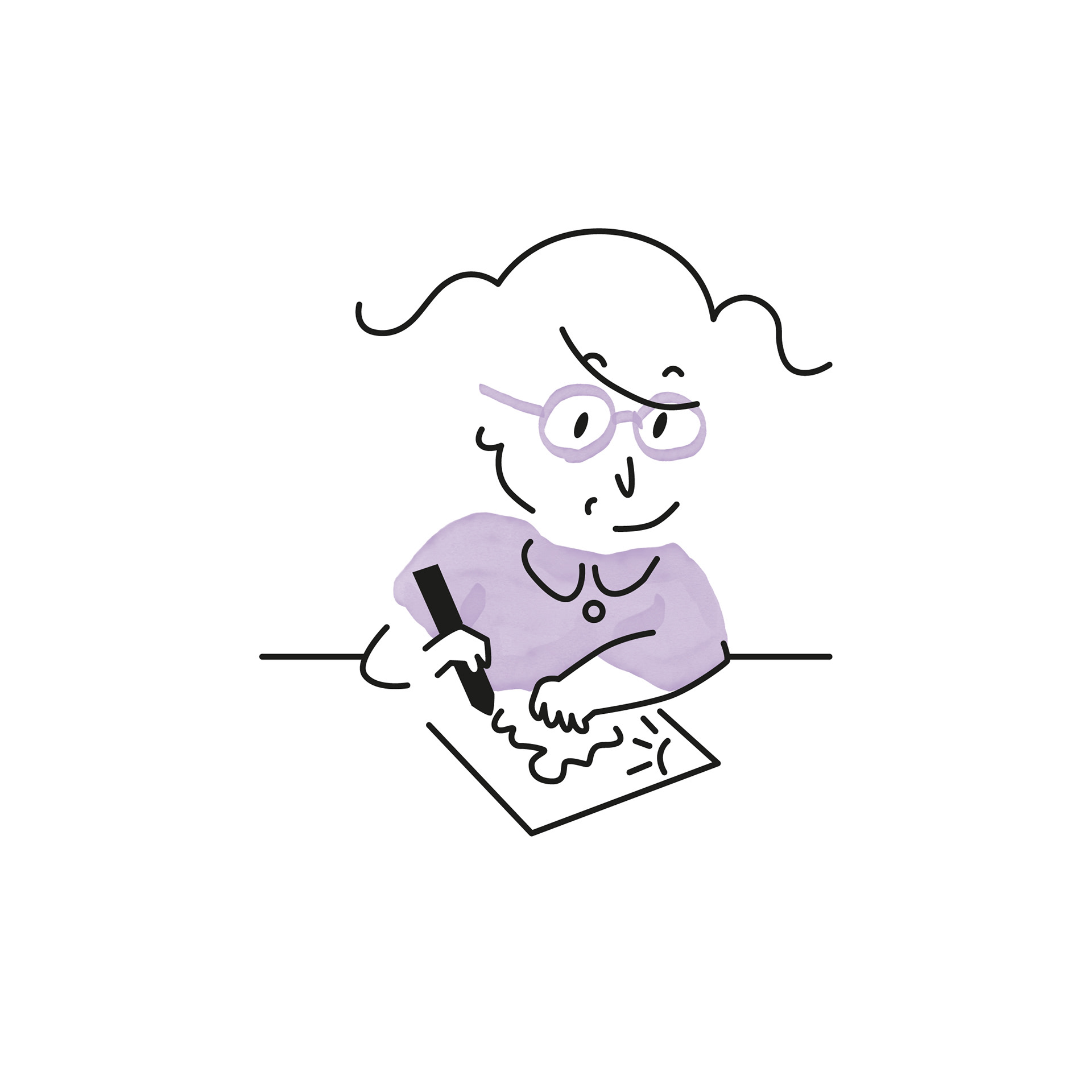
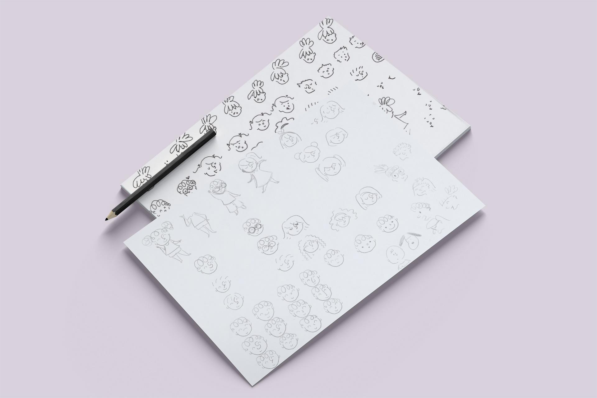
The client had wanted to incorporate some kind of illustration to the brand identity, so I expanded that idea to a whole series of simple illustrations that could be mixed and matched according to their needs. For the logotype, it was important to have something that could work well both with and without the illustrations, so it would be suitable for more sober applications when necessary.


A carefully crafted service
A particularly noteworthy characteristic of Tatiane Ribeiro is how personalized their service is in comparison to the competition. I wanted their visual style to reflect that aspect too, so that was how the color blocks made with markers became part of the illustrations. It was a way to add a more handcrafted touch to the very smooth, clean black lines of the drawings.
With plenty of white space, colorful touches and the smart use of handmade elements, the brand identity was kept light and with just the right amount of playfulness, while also allowing for versatile applications.